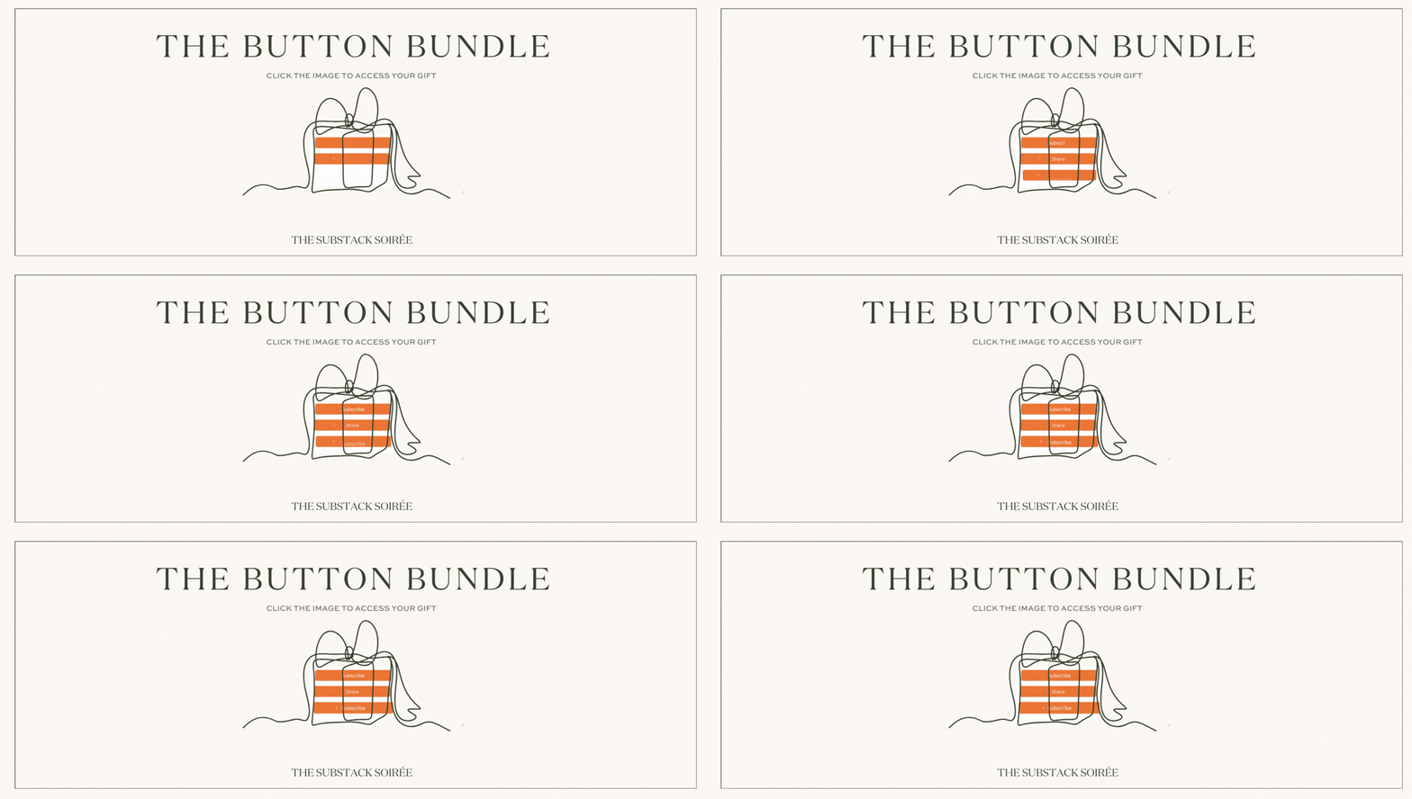
The Substack Button Bundle
✨FREE✨ animated Subscribe and Comment buttons for your Substack posts. Because life’s too short not to be extra
So, you’ve done the hard work and got readers to your page. Hurray! Now it’s just the small matter of getting them to subscribe and engage. Easy peasy, right? 👀
The truth is, it’s awfully easy to be a passive consumer of content online. We can all be guilty of it at times - reading and running without dropping a comment; letting Instagram serve up a carousel of videos on a perpetual, hypnotic loop.
Sometimes, no matter how great and engaging our content, our readers need a bit of a gentle nudge.
With the two of us both being excessively nerdy about both online marketing and user behaviour, we know there are two key elements that can optimise the number of people who will actually click any button to engage.
The first is a direct and explicit call to action (aka, what you want them to do)
The second is to give it an eye-catching design.
Substack already has great built-in options for both of these elements, but we thought we could go one better on that.
We wanted to make our ‘call to action’ buttons stand out more, bring in more subscribers and reflect our values and our writing voice too. How?
Enter, our newest freebie: the button bundle!
A free, editable batch of animated, colourful buttons that you can use in all of your Substack posts. Buttons like the one you see below… (which works, btw, for anyone who isn’t yet a subscriber here… 😉)
And here’s the regular (and perfectly lovely) built-in Substack button, for comparison.
A little less grabby, perhaps? A little easier to scroll on by.
Customised buttons for your Substack
Use these souped-up little numbers anywhere you would usually add a Substack button - Subscribe, Leave a Comment, Share - anything from that whole dropdown list of options you see when you click “button” in the post editor.
And we’ve made sure to still keep them looking Substack-coded so people will still automatically understand what they are for, and what they need to do .(This is important - good buttons are like a universal symbol for ‘click here now, human’, and we don’t want to mess with this!).
Changing the button text has been possible with ‘Custom Button’ but now you can make yours that extra bit fancy and eye-catching - change the colours, change the movement, as well as the text!
While we’re on that, the wording is important for that first part mentioned above - the direct call to action. “Leave a comment” is fairly self explanatory, but depending on your voice and your readers, it could also become “tell me below”, or “confess all your secrets”, or “join the discussion”.
Likewise, the option to “share this post” might get a little more traction if it calls on your readers to “tell all your friends!” instead.
‘Subscribe’ might become something like…
Or
(but seriously - are you Subscribed to us yet? 🙊)
Have fun with it and get creative. Just don’t do anything spammy, mislead your readers or make it hard for anyone skim-reading to find the button they need.
And as always, this little customisation is completely unofficial and entirely optional - we’re not here to add any pressure or expectations for anyone. We just love Substack, love branding and love how many ways the simple functionality here lends itself to so much freedom and fun ❤️
Grab the button bundle HERE and go to town.
But wait! We’ve got another gift for you!
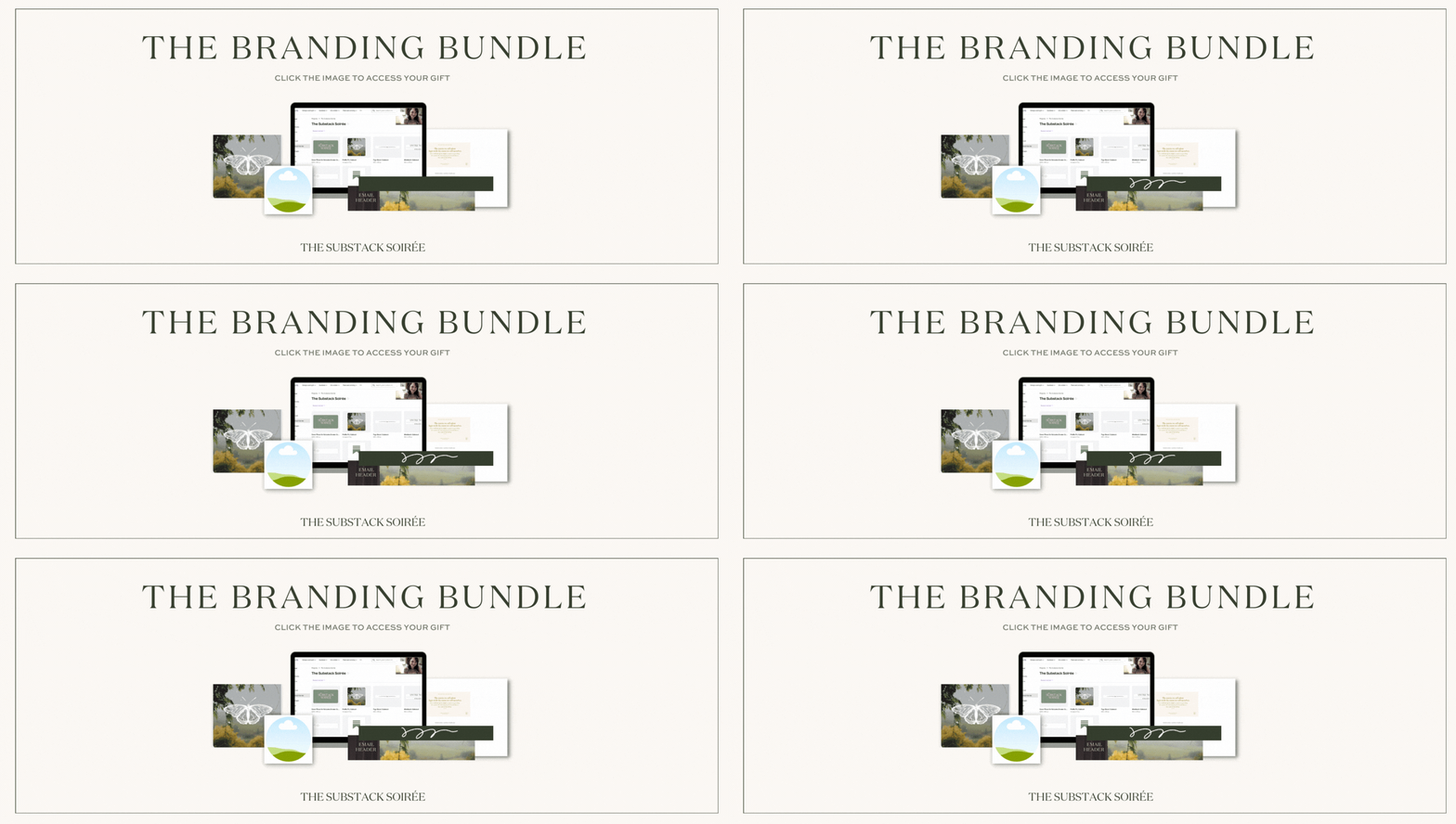
The Branding Bundle
Yes, we already shared this once, but we know that the tech gremlins conspired against many of you accessing it all.
Subscribed but never received it? Received it but couldn’t get the Vimeo robots to play nice? Well, good news! The Branding Bundle, both templates and walkthrough video are now both available to all, without even needing to subscribe. We wanted to make it as easy as possible for you all to get access to it, so you’ll now find it at the page linked below.
Click HERE or on the image above to be taken straight to the branding bundle.
Click HERE to get the new snazzy button bundle too.
And if you want more magic freebies like these from us in future, click the button and make sure you’re subscribed. We’ve got a whole lot of exciting and creative things coming up very very soon…


Love these! 🥰
what my perfectionist brain struggles with is the white peaking out from behind custom buttons with round edges, that’s visible in dark mode only but annoys me that I stoped animations in my signature even 🫣
seriously need get my priorities right because an animated button or signature is so much more fun (despite white background) than a body Substack button or static signature (without animation)
The Substack Soirée publishes, immediate sense of bliss!