Your Button Bundle
Ready to get started on making custom buttons for your Substack?
Click HERE to access your customisable, animated buttons.
You’ll be directed to create a template, click ‘Use Template’ and it will open up in your own Canva account and it’s yours to edit any way you’d like.
Then scroll down to read our tips & instructions.
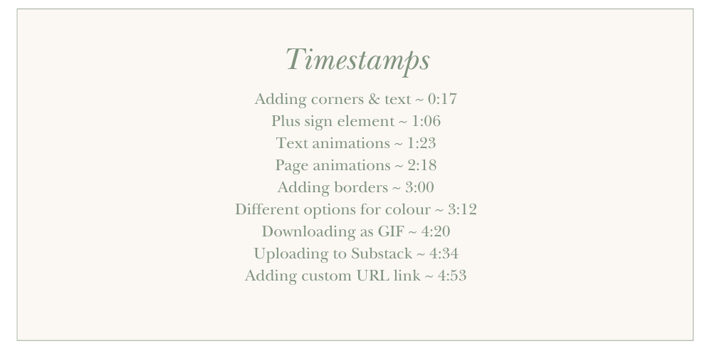
(It’s silent, there’s nothing wrong with your headphones/speakers. Just watch and copy!)
A few notes for you:
Brand new to Canva? Our walk-through video over on our branding bundle will show you how to begin.
To be animated, you must download your buttons as GIF’s, which means the background cannot be changed or made transparent. If your publication uses a different background colour to white, change the background of the button canvases provided to your publication colour.
In your post editor, add your button like an image and use the link tool to direct it to the relevant action page. Watch the video walk through above to see how!
Some of the Canva animation suggestions are on the left side of crazy. (Step away from the wiggle one.) Think about your publication and how you want it to come across. Energetic and fun? Slow and considered? Choose animations to match.
Less is often more. Maybe you want your button to look identical to the Substack default, but to simply wiggle a bit?
Similarly, too many buttons on one page and they start to lose all their impact. As you might be starting to notice here on this post 🙈
You can change the text to read whatever you’d like, and change the font, but we highly recommend that you do not stray too far from the general size, font and formatting of standard Substack buttons.
The canvas size is wide so the button can be shrunk down but still remain centred.
The buttons provided are not templates, they are options for you to play with and make your own. Change the font, colours and animations as you wish.
Either page animations (meaning all of the elements will be affected by the animation by selecting the entire canvas in Canva, as shown in the video) OR only the text animation (by selecting only the text) can be added. We’ve give options for both there for you to play with.
Substack’s built-in ‘Subscribe’ and ‘Upgrade to Paid’ buttons are dynamic, meaning they show differently depending on somebody’s current subscription status. Ours don’t do this, so if an existing subscriber clicks they will be prompted to write a recommendation instead.
As always, this is totally unofficial and not endorsed or created by anyone at Substack HQ. Hopefully they don’t mind us sharing it, though. We think they’re a pretty cool bunch.


